Color Play
Color on top of color on top of color OH MY!
As we continue to spend more time at home, the importance of emotions injected into our space rises. Experimenting with the juxtaposition between color and shapes, these designs represent rooms that aren’t afraid to experiment with color combinations whether it’s on walls, in furniture, or a mixture of both.
The key to executing this trend is selecting a strong color palette based on the color theory that feels most inspiring (complementary, analogous, split secondary, etc…). In addition, there needs to be a cohesive theme that flows throughout the furniture and decor pieces to balance the space.
If you look at the examples of Color Play below, there are different degrees of properly executing this aesthetic such as complementary colors and shapes, minimal monochromatic, and unconventional eclectic (things that won’t necessarily work together but do). These interior designers have created spaces that speak creative volumes through color!


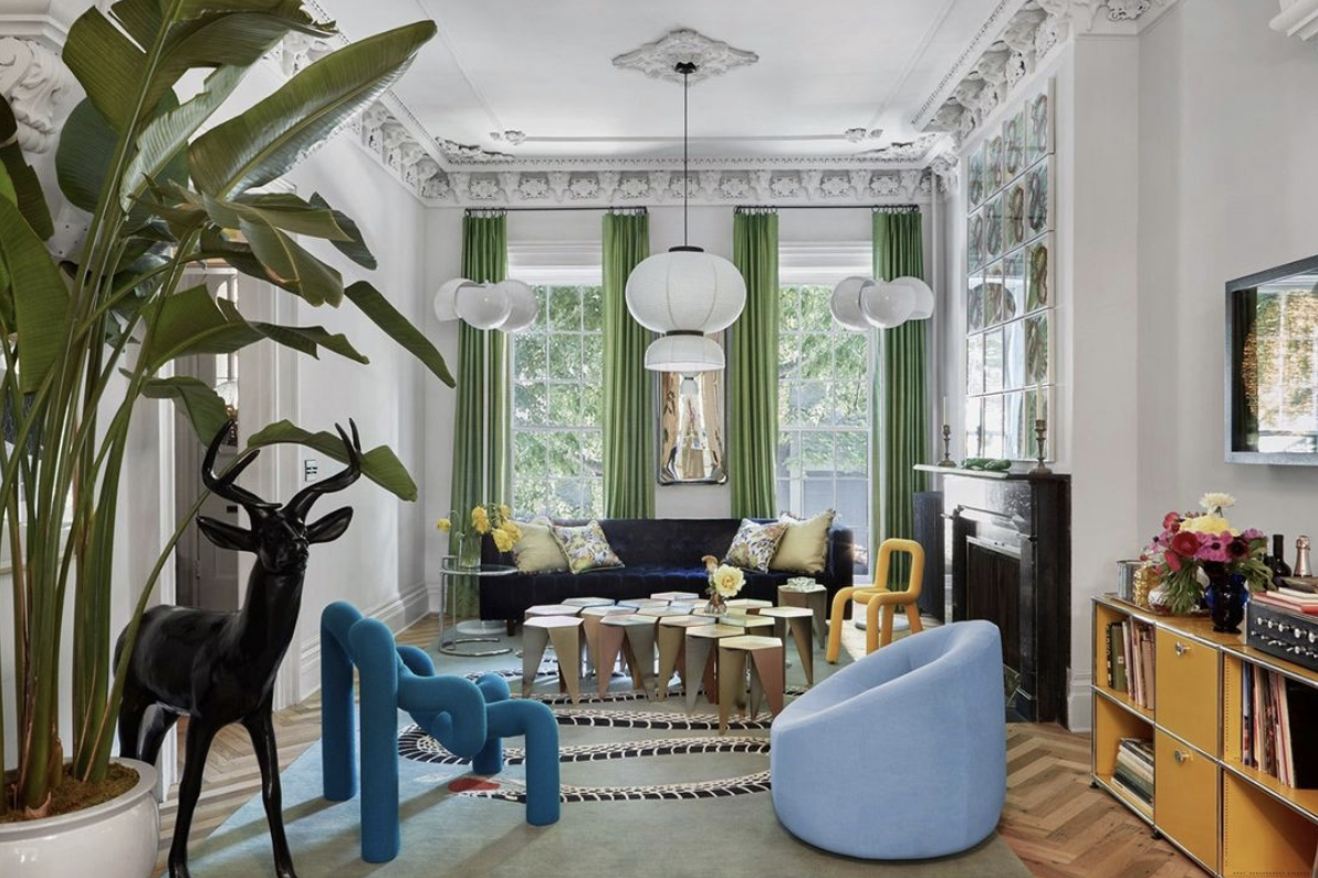


Photo Credit : Carlos Mota | Eddie Maestri | Emily Seider | Fawn Galli | Flack Studio | Hannah Roseware | Hugo Toro | Job Smeets
Marjorie Skouras | Knickerbocker Group | Trish Cyrus x2 | WorkStead